
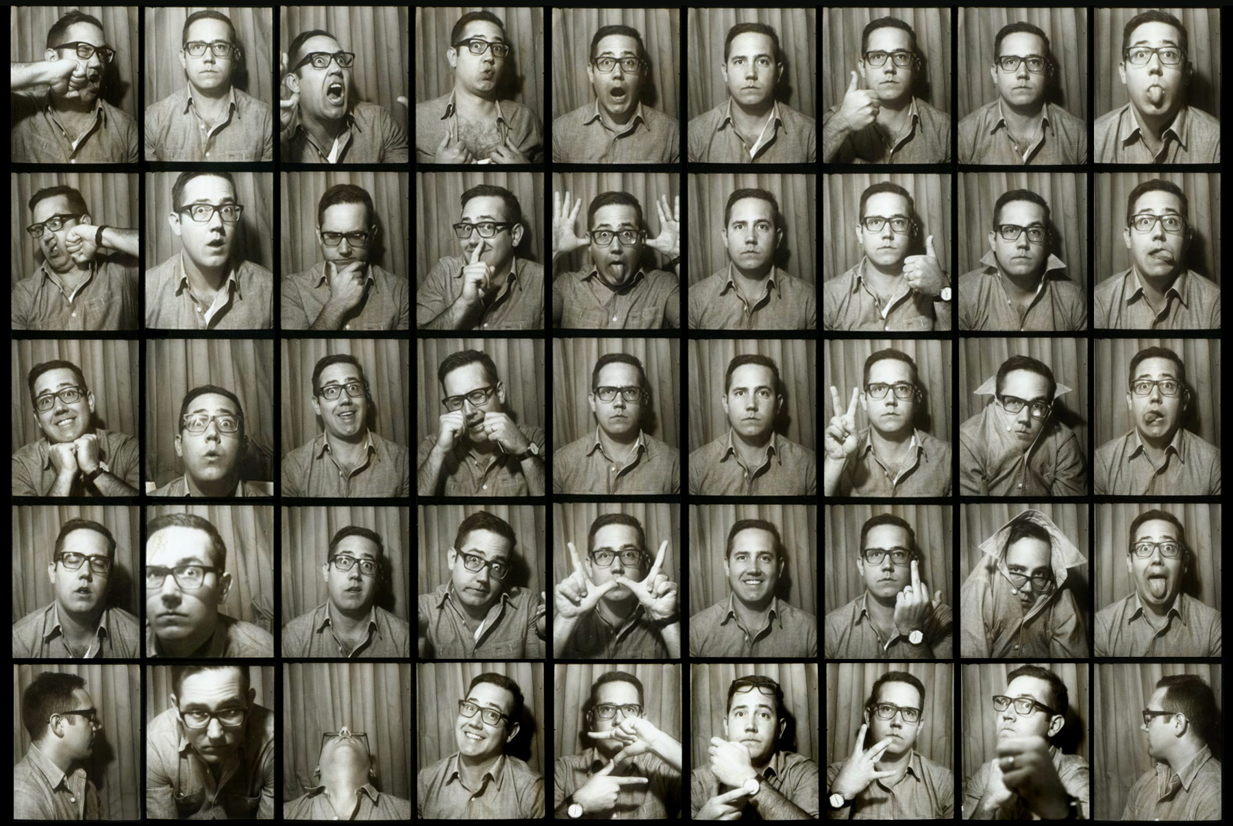
Erik Marinovich
Erik Marinovich is a San Francisco based lettering artist and a cofounder of Friends of Type. He has worked for clients including the New York Times, Bloomberg Businessweek, the Atlantic Monthly, Wired, Metropolis, Ford, GAP, Diageo, and Nike. In 2011, he was named Letter Cult’s Person of the Year and in 2012, he cofounded Title Case, a lettering and design studio, with fellow lettering artist, Jessica Hische.
Interview
Describe your path to becoming a lettering artist.
I always knew I wanted to do something creative, but the path I took was more of a zigzag than a straight line. After high school, I studied graphic design at Cal Poly, a small liberal arts college in San Luis Obispo. It was a decent school, but my classmates were really the ones who engaged me in what was happening with art at the time. Graffiti was really popular and through that, I had more of a soft exposure to areas of typography and lettering, which confirmed what I always knew—that I enjoyed lettering—however, I had dedicated myself to learning design.
After graduation, there was no design work and I couldn’t find a job. The only job I could find was apprenticing with my dad in preparation to take over his masonry business. I did that for almost a year until I realized that, deep down inside, I wanted to do something more creative.
I had an awesome opportunity to intern at a small art gallery in San Jose and I took it. The gallery was showing Shepard Fairey, David Choe, and all these amazing artists. I was only an intern there, but I got to meet people who were similar in age to me and giving a big, “Fuck you!” to the world. They were doing their own thing, broke, and happy about it. That made me want more.
Then my girlfriend, who I was in a long-distance relationship with for two years, called me and said, “I think we should move to New York and start a new life together. I’m having a garage sale this weekend and selling all my stuff to save money and move there. You should do the same.” I replied, “Alright.” We saved enough money to move to New York and live there for three months. Those three months turned into over five years and my girlfriend is now my wife.
In New York City, I got a job at Landor Associates and that was where I had my first encounter with lettering. That job exposed me to every type of design under the sun and I often found myself spending a good portion of time noodling with type, but it took a while for lettering to turn into a full-time obsession.
My second encounter with lettering happened after I left Landor and moved on to another branding studio, FutureBrand. That was where I had my first lettering job, which was for the Yerba Buena Center for the Arts in San Francisco. I’m from the Bay Area and had been to the museum on many occasions, so I wanted to make the identity great. However, I was terrified because at the time, I wasn’t 100% confident with my skills at drawing letterforms in Illustrator. Thankfully, with the help of my patient creative director, Wally Krantz, and co-worker, Aaron Carámbula—who I later started Friends of Type with—I learned the tools, tips, and tricks to have a more comprehensive understanding of how letters work and pair together. And I’m happy to say that my hand-drawn logo type was selected to be used by the Yerba Buena Center for the Arts.
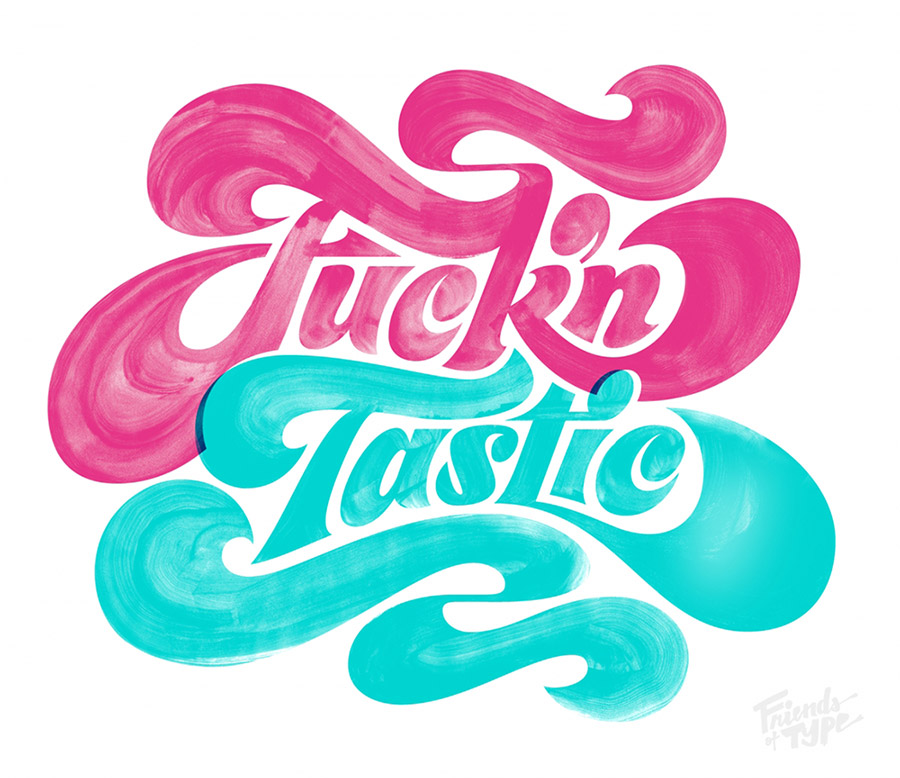
My third and final encounter with lettering changed everything. My wife and I, who are restless souls, decided to leave New York and move to California. We lived in LA briefly and then settled in San Francisco. One day, after I had a bad client meeting, I drew a lettering sketch and sent it to my friend Aaron over iChat. He told me I should post it online, but oddly enough, there were no lettering sites at that time—at least none that we knew of. We decided to make one and eight hours later, Friends of Type was live. Aaron tweeted about it and it got retweeted and retweeted. Our visitors grew and although we had created the site as a side project and a way for us to keep in touch through a mutually loved medium, it turned into much more than that. At that point, we invited our two close friends, Jason Wong and Dennis Payongayong, to contribute to Friends of Type as well. Once they came on board, the four of us challenged each other so much that, for a year straight, we posted one to two new pieces of original content to the site each day. The first year of Friends of Type really allowed me to create a portfolio of personal lettering work that would later launch my lettering career.
“There is a blue-collar work ethic to lettering—it’s repetitive and takes a long time to complete, but when you’re finished…there’s something concrete to show.”
That’s super awesome! Right now, you’re a full-time freelancer and you share a studio with Jessica Hische. How did that come about?
When I landed here in San Francisco, I spent about two years working out of my apartment as a freelancer—as you know, that is very glamorous (both laughing). I had no social interaction during this time, except for when I’d talk to my two cats, Tomo and Mali—I swear I’m not crazy!
Meanwhile, I met Jessica at a TypeCon conference through our mutual friend, Aaron. We were all having dinner together one night and Jessica said to me, “Hey, I’m moving to San Francisco. Do you want to share a studio space with me?” I thought, “With Jessica Hische? For sure.” We’ve now been in our studio space, Title Case, for a year. Although it’s a shared space, we’ve been pretty focused on our own work, but are now starting to collaborate on more projects. It’s been enjoyable having another creative person in the room and being able to bounce ideas off of one another and, more importantly, have someone to check our kerning. (laughing) When Jessica and I formed Title Case, we obviously wanted it to be a place where we could get our work done, but we also wanted it to be a space where we could host events, conduct workshops, and help contribute to building a greater community around lettering.
You initially studied the design end of things. Did you have an “aha” moment that led you to focus on that?
There was no real specific moment, but I have spent more of my life drawing than doing any other activity. When I attended community college, I signed up for several art classes, one of which was an Intro to Design course. The class was taught by a couple who ran their own studio in addition to teaching. They were so enthusiastic about design that it intrigued me enough to continue on the path of pursuing graphic design as a career. Deciding to pursue it was more a result of the people who I was lucky enough to be surrounded by. Throughout college and my career, I’ve always been surrounded by a handful of talented people who have helped shape me as a creative person.
Where did you grow up and was creativity a part of your childhood?
I grew up in the South Bay area and it was a typical suburban neighborhood. I was fortunate to have a bunch of kids who lived on the same block as me, even though they were a little bit older. We’d all skateboard together on our Powell Peralta decks. As a kid, those skateboard decks were super influential; I remember drawing the Bones Brigade Ripper logo over and over until I got it just right.
I was also outside a lot because of my dad. As I mentioned, he had a masonry business and any time my brother Anton and I were on vacation from school, we had to hang out and work with my dad. Before we were old enough to actually work, we’d spend our time stacking bricks and making large battle scenes with our G.I. Joe figures.
Both of my parents are very creative in their own ways, but my mom was definitely the biggest advocate for making sure I was always signed up for some sort of creative activity, whether it was a painting class or after-school program.
Was there anything particular that you were into as a kid?
I grew up reading comic books and drawing comics. Even when I was in high school, I preferred being alone and drawing over anything else. I’m pretty sure there was a time when my parents worried that I was spending more time drawing and reading comic books than going out with friends. I fully recognize my tendency to become infatuated with something so much that it’s all I can think about or do.
What was your favorite comic?
X-Men! That was my jam. I read that series over and over again.
Did you have any mentors along the way? I know you mentioned a few people earlier.
Yes, I’ve been very fortunate to have many. My first real mentors were Brian and Cherri, who owned the gallery I interned at after college. I was lucky enough to meet many of the artists who showed at the gallery. For me to be that young and be exposed to the likes of Shepard Fairey, David Choe, Dalek, AJ Fosik, and Tiffany Bozic was something that, even at the time, I realized was special.
Wally Krantz was another mentor and he was hugely influential during my design phase. He was my creative director at FutureBrand and he’s the man behind some of today’s largest and most iconic branding projects. Despite his impressive track record, he’s the most humble person I know and he showed me that you don’t have to have an ego to make it in this industry.
Finally, all the guys I share Friends of Type with—Aaron Carámbula, Jason Wong, and Dennis Payongayong—always amaze me with how versatile and creative they are. They’ve pushed me harder than anyone else I’ve ever worked with, and for that, I’ll always be grateful.
Was there a favorite person you got to meet while you were at the gallery?
This guy, Adrian Lee, who runs a really well-known tattoo shop in San Jose called Newskool. He did a show with 40 large plywood panels that were hand-painted, cut with a jigsaw, and incorporated a lot of lettering. At the time, I had no idea what lettering was. I remember getting lost in his painted letterforms while helping him hang the panels. It’s funny how you don’t always recognize the importance of certain experiences in your life until later on; that was definitely one of those moments for me.
Was there a point in your life when you decided to take a big risk to move forward?
I’ve always taken risks because I’m convinced that without them, I’ll never feel a sense of accomplishment. The biggest risk I’ve taken was in this last year when I opened up Title Case with Jessica. It’s something I’ve always wanted, but the commitment scared me. Being a freelancer and working from home is like going a comfortable 35 mph; having your own studio is like going 75 mph and I had to mentally prepare myself to move faster. Moving into Title Case also marked my official departure from strictly design projects and entry into doing lettering full-time.
Are your family and friends supportive of what you do?
It’s funny because my family is creative, but in very different ways—my dad is creative with his hands and my mom with designing interiors. I think everyone is creative at heart and it’s unfortunate that some people don’t get the opportunity to pursue it after childhood. That’s why I’m very grateful to have parents who have nurtured and supported me to become a creative individual.
I do think that lettering is very honest work and I’m still trying to help my parents understand why that is. I tell my dad that lettering is very similar to his masonry work. There is a blue-collar work ethic to lettering—it’s repetitive and takes a long time to complete, but when you’re finished, just like bricklaying, there’s something concrete to show.
I also can’t forget to mention my wife, Dana. She knows me better than I know myself and keeps me on track and working toward my goals. A big part of being successful is having people who will support you like that.
“…so much of lettering is being confident with your hands and what they can produce…”
Do you feel a responsibility to contribute to something bigger than yourself?
I think most of us do and it’s just a matter of time until we figure out what we want to contribute. For me, Friends of Type has opened a lot of doors and given me and the other contributors opportunities to do speaking engagements. Last month I did my first solo lecture at PSU at Kate Bingaman-Burt’s request. Looking out at the faces reminded me of when I was young and attending lectures and looking to hear words that would inspire me. I do feel a new responsibility to speak in a tone of voice that motivates and lets people know that I’m 32—I’m not a new or young artist—but I’ve achieved what I have because I’ve worked hard for it and that hard work has paid off. Everyone has this opportunity, but you can’t be afraid to start something new, no matter how old you are or how inexperienced you feel.
Are you satisfied creatively?
I hope to never feel satisfied because when that day comes, I won’t feel creative. I think many creatives can agree that there is a part of them that wants to do and try different things. I’ve always felt this and think it’s a healthy mindset to have. Creatives should always be open to new ideas and experiences. If you want to continue to grow, it’s important to not settle down doing only one thing.
Is there anything you want to do in the next 5 to 10 years?
In the last few years, I’ve created work to exclusively fit a format that is 2000 pixels wide, which is the image dimension for posts on Friends of Type. It seems fitting that I start creating work out of the digital context and apply more effort into making work for the analog world.
The next project I plan to start will take me a few years to complete. Over New Year’s, I was in Lake Tahoe at a friend’s family cabin and there was a heavy snowfall. We had to shovel off the deck because the weight of the snow had the potential to cause it to collapse. I volunteered to shovel and once I got out there, I figured out what my next personal project would be. I saw that out of the six feet of snow, I could form the letter “A”. Over the course of the next three days, I shoveled away the snow and made an “A” out of it. After completing it, I decided to build a large-scale alphabet using natural elements. The next letter I’ll do is “B” and I picture it being ten feet tall and made of bricks. Then I’ll move on to “C”, and so on. This is a way for me to get some exercise because sitting at the computer is like eating Twinkies all day. (laughing) Also, so much of lettering is being confident with your hands and what they can produce and working on a larger scale causes you to see things differently.
Are you going to put your project online?
Eventually. It’s a little premature at this point in time. First, I need to get a tripod and a better camera. I documented myself sculpting the “A” using a time-lapse app on my iPhone. I had no tripod, so I taped my phone to the side of a thermometer. I wish the setup would have been more professional, but there’s honesty in the way it was recorded. Since I’m not a photographer or savvy with making videos, this project will give me the opportunity to learn more about that process. Who knows? It might influence me to become a photographer next! (laughing)
If you could give one piece of advice to a young person starting out, what would you say?
Don’t quit. Absorb everything you can for as long as you can. Be conscientious of the time you’re wasting, and don’t waste it. Surround yourself with talented and humble people.
How does living in San Francisco impact your creativity?
Tremendously. My studio is in the Mission District, which is predominantly Latino. There are a lot of Latino owned and operated businesses with hand-painted signs—and I’m not talking beautiful, gilded signs—they’re slightly innocent and amateur, but because of that, I see letterforms drawn in unexpected ways. I’ve noticed my work becoming a little more loose because I’ve started to use more brushes to try and mimic the style of lettering I see around my neighborhood.
“Don’t quit. Absorb everything you can for as long as you can. Be conscientious of the time you’re wasting, and don’t waste it. Surround yourself with talented and humble people.”
Is it important to you to be part of a creative community of people?
I’m a very social person and find it important to have open dialogue with all types of creative people. Some of my closest friends are designers, architects, photographers, illustrators, sculptors, and writers; I love the conversations that can come from a multidisciplinary group. There is so much we can learn from each other and sharing our experiences with one another can only help build a smarter, stronger creative community. I’ve seen this firsthand during the morning hangouts that Jessica and I host at Title Case. We started them as a way to meet like-minded people in San Francisco. Because our space is limited, it’s always a small group, which contributes to everyone getting to know each other. We’re fortunate to have a space and happy to offer opportunities to help our city have a tighter creative community.
It’s great that you guys can do that. What does a typical day look like for you?
Now that I have a studio, I’ve tried to have a better balance of life and work. When I worked from home, the computer was always in front of me and I was always working. Now, I usually work 9am–6pm, which is similar to my wife’s schedule. She’s the new creative director at a children’s clothing company in San Francisco called Tea Collection. Having a studio helps me to have time away from the computer and make time for things that really matter—like watching Workaholics. (laughing)
Do you have a current album on repeat?
The new Mac DeMarco album, 2. His music sounds as if it’s being played on a record player that is stuck between 33rpm and 45rpm. It has a weird, but very listenable rhythm to it.
Do you have a favorite movie or TV show?
Easiest question you’ve asked—The Shawshank Redemption!
I (Tina) love that movie! Someone else who we interviewed also said that. Oh, it was Aaron Draplin.
There are certain movies you watch when you’re younger that you watch again when you’re older, and they’re awful. The Shawshank Redemption is not one of those. I’ll watch that movie again and again, even if it’s on TBS with commercials. I mean, Tim Robbins and Morgan Freeman—do you need anybody else in a movie? There are so many lessons in that film, especially the idea that you could have everything against you, but if you have a plan and are patient, you can accomplish the unthinkable.
What’s your favorite book?
The Amazing Adventures of Kavalier and Clay by Michael Chabon. It’s a New York centric book that follows two cousins from childhood to adulthood. One of the main themes of the story is the introduction of comic books at the high point of their popularity. It’s brilliant and paints such a vivid picture of what life might have been like in NY in the early 1940s. I’m sure if I had a time machine, I’d visit NY during that time to buy some comic books and marvel at all the hand-painted signs throughout the city’s streets.
Favorite food?
For the time being, I’m going to say burritos. Give me a super-sized burrito from El Papalote with vegetarian black refried beans, extra avocado, and no rice. If only I was 21 again—I’d probably eat one every day. Oh well, one can dream.
What kind of legacy do you hope to leave?
That it’s okay to reinvent yourself—it’s the only way you grow. Always allow yourself to change.