
Emergence Issue: TGD's fifth issue features a dynamic group of 15 creators who are deeply committed to addressing systematic challenges in their communities through creativity and emerging ideologies. Buy Now
Can you speak a little bit about where you grew up and how that place shaped you?
I grew up in a little town of 15,000 people called Finale Emilia in north-central Italy, near Modena, where the balsamic vinegar and all the luxurious cars like Ferrari and Lamborghini are from, not that any of us owned any of that. I’m an only child of two only children. Growing up, I didn’t have aunts, cousins—and I still carry that loneliness from missing out on having a big biological family.
I had three grandparents that I used to spend a lot of time with, particularly one of my grandmothers. In retrospect, she has been my creative muse. She was a seamstress. I would make drawings of the little dresses that I would like to have for myself or for my Barbies, and she would make them. It was a creative process.
Growing up in Italy, you’re surrounded by history, you’re surrounded by a sort of elegance of the architecture. I feel this shapes the way that many Italian designers approach the world of design. I think our aesthetic has been trained to appreciate these details. But I remember the first time that I started to see things like MTV and influences outside Italy, I started to have this feeling that life was somewhere else. I was itching to try and figure out where.
You’re a trained architect. Can you talk about your educational steps and exploring that professional path?
Like many people at 18 years old, I had no idea what I wanted to do. I was at a fork where I was also a semiprofessional dancer. I started to do ballet when I was young, then moved into contemporary dance. I applied for a scholarship in contemporary dancing, and I got accepted for a prestigious program.
My parents were reasoning with me: “Do you want to bet everything on your body? Is dance really what you feel like doing?” And as much as I wanted to go, it wasn’t feeling right. Architecture, at that point, was my way of not choosing. It was my way to merge my need for structure and numbers and the scientific with my love for the more emotional, intuitive, creative parts—composing buildings and going to think about how people will leave places. I mean, there’s a lot of creativity in there.
In college I was really interested in group projects; I was always the one who wanted to build the presentation. I would be the one making the diagrams about the building usages.
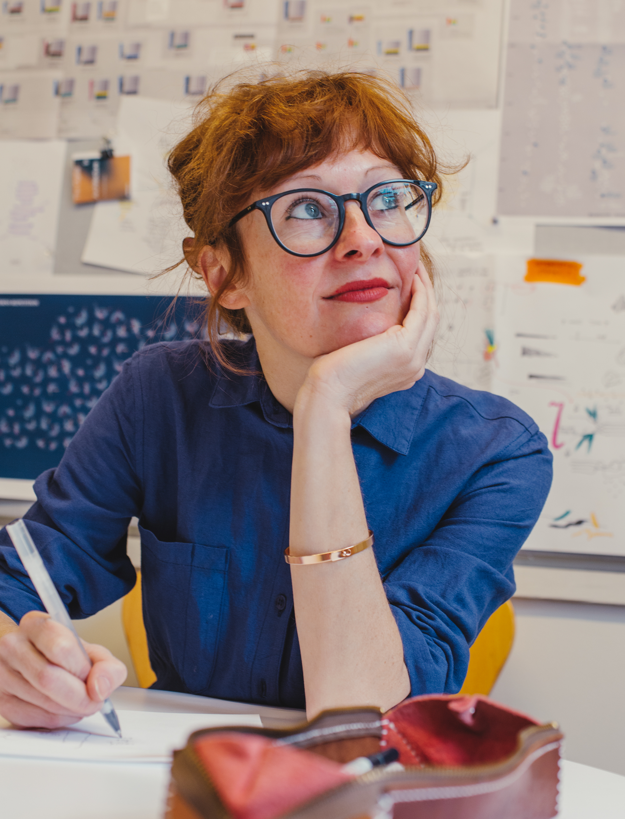
After college I started to work on the installation of physical spaces, but most of the time I was the one focusing on content and translation. Progressively, I started to integrate more and more data into the projects that I was working on. I come to data from a very, I think, story-driven and design-driven way. It’s a lens that we have to see the world through and a design material that we can use to communicate these stories.
So much of your creative professionalism is built on structure and form and precision, right? Whether that’s as a dancer or a seamstress or an architect or an information designer.
I love rules. I love coming up with systems. Structure gives me freedom. Having everything planned and ordered gives me freedom and vision and openness. I’ve always loved music notation, for example, which is a way to record the reality of the way a person plays and then to translate it into a language that everybody can read.
With all that being true, how would you describe your current creative work to people who haven’t experienced it?
It always goes in layers. I try to understand if people know what graphic design is, then I try to understand if people know what data is. If I needed to explain it to someone who has no recollection of what data is, I would probably start with the final manifestation, which is usually as a visual. Visuals can look like patterns, like illustrations or abstract paintings. A data point is a piece of information, quantitative or qualitative, that helps us tell stories in a nonlinear way. With these visuals, there’s always a legend or key code and some text that will explain how to interpret every symbol, color, size, position, layout, and connection as a data point. There are different entry points through a legend, for the reader. I make a point to give people the tools and access to the information that I used to build the visual. What I do is primarily about using data as a way to tell different stories.
Do you have a sense of what you want people to feel and experience when you’re creating?
Designing for a mural in a museum is very different from designing for a magazine. Designing for an interactive experience that you will use on your mobile while on the subway is very different from designing for a dashboard that a person in an IT department needs to make decisions based upon.
As it happens with many design projects, you need to take this new world that you’re entering into account—the audience and the time and attention span and knowledge that they have. You need to really have a brief for yourself.
There are topics that are more about inspiring and entertaining the audience— then we’ve worked for organizations such as the Gates Foundation, the World Health Organization, the UN, where the goal is all about understanding. It’s about giving people access to new knowledge and opening up questions for them.
Do ideas for you develop after the data or before the data?
It’s in parallel; it’s never before. As soon as I have conversations about the topic, I start thinking about possible ways to present the data. The more that I get into the data, the more I narrow down the possibilities, but sometimes the inspiration that I have can even inform the analysis that I do on the data. We’re not talking about manipulating data, we’re talking about an editorial process. I think that every process of data, in any case, is authorial and journalistic because data is not objective. Especially when the project is more artistic and I have more freedom, I’m sketching ideas that can even inform how I go about finding stories in the data.
Right. That’s where part of the fascination comes in for me. I think all designers have an ethical responsibility to what their work does, but particularly when there may be the perception of objectivity.
I wouldn’t say that I think that there is a presumption of objectivity, but then it’s about remembering the data’s primarily human-made. A human being designed the sensor and decided what to collect and what to leave out. I think that my work is expected to be rigorous more than objective. I want my work to be rigorous, and I want my work to be very accessible—even if it’s dense—through providing people keys to read it and also being transparent about the method of data collection and the sources.
“I want my work to be rigorous, and I want my work to be very accessible—even if it’s dense—through providing people keys to read it and also being transparent about the method of data collection and the sources.”
I love that clarification around the difference between rigor and objectivity. It’s a really important note. You’ve written about responding to some of the coldness of data.
It started to appeal to me how data was almost never termed in conjunction to the people who generated it; data never had human qualities. Because of how I came to data, it felt like something interesting to name. The idea of data humanism came intuitively. It started with the idea that data is a beautiful way to see reality, but we need to ask very human questions if we want to get interesting results.
Then there was the kind of feeling where everything is just a dashboard with these charts that nobody will remember because they all look the same. And I think data humanism was also a response to that. Data can be beautiful and deserves to be beautiful because then it will get more attention and people will remember it.
In line with that intuitive and deeply human process, you recently did a project with the Rand Corporation around mental health. Can you talk a little bit about how that project emerged?
It was the first artistic resident collaboration for them. We decided the first topic would be mental health because, after a year of the pandemic, we all felt that it was really important.
We started to look for different statistics that came from Rand reports and what really struck me is the number of people affected by mental health who don’t receive any treatment. But if you saw a bar chart of the people who get treatment and the people who don’t, you’re forgetting it right away. The idea of working with beautiful images that come from MRIs also emphasized: “Hey, our brain is beautiful. What’s going on in here, even if it’s flawed, it’s beautiful.” We started exploring how to use that visual metaphor to produce a data graphic. We wanted to create awareness in a way in which people would probably share.
It’s stunning work.
Thank you. I mean, it’s very simple data that most people would have represented with a pie chart, but you need to speak to people’s hearts. I think the more you do it in a way that makes people curious enough to say: “Oh, what is this? I want to know more about it.” Well, that’s a process that sticks in their brain a little more.
I’m curious where you turn for inspiration, or to try to break that log jam in your work when you have a mound of data points in front of you and are at that brick wall.
Well, I think that having data is way better than not having data. It’s not about, “I have this blank page.” There are certain things that you know intuitively how to represent. Obviously, you want to do work that is noble and original and creative, and you don’t want to repeat yourself, but a time frame is a time frame, for example. And, a million data points is really different than 50 data points. All of that starts to bring clarity into where to look for inspiration. It can be abstract art. It can be physical drawings, it can be nature. It can be a pattern that I’m wearing. It can be anything that clicks with the topic and makes me want to do the first sketches.
Bouncing ideas back and forth with my team is the way to get creatively unblocked. During moments when I’m like, “What is the right question to ask here?” just having a conversation about it clarifies.
Are there critical collaborators or relationships beyond the team that really influenced your work, Giorgia?
It’s important to mention my ex-husband, Gabriele; we’re like family to each other and still collaborating. He’s one of the partners at Accurat, so when I was there, we spent every evening just talking about work, sketching together. I think we influenced each other very deeply.
The Dear Data collaboration with Stefanie [Posavec] was mind opening; even the conversation that she and I had. [The two information designers sent weekly postcards with visualized data
drawings from their lives. The yearlong project was shared online and collected in a book, Dear Data.]
My collaboration with Kaki King, the musician, was critical to adding different dimensions to how I can even perceive my work.
I think all the external collaborations that I’ve had are somehow milestones, in a way. I don’t think I’ve ever had any mentor. I’ve never had any boss, besides maybe a few months after university. We are made of the experiences that we share with others. I’m not really good at working by myself. I get bored. I really like sharing.
How do you view your own personal development? What are you looking to explore or master?
Right now, I’m in kind of a self-reflective mode. I’m trying to adopt a more creative way of thinking in everything that I decide to do.
If all goes well at Pentagram, I’ll be among a new generation of partners. I think in a few years this will mean redefining some of the modalities that older agencies adopted. If you see Pentagram as a stage, there’s a lot that still can be experimented with at the intersection between client work and speculation. At the intersection of pure graphic design and something that also has a philosophy behind it. In the way that we collaborate with our team, and the way we credit people. I’m really open to observing what works and what doesn’t work. I am happy when my team is happy. And so, that is always a priority for me.
How do you view your legacy? How would you like to be remembered?
Having an impact on people’s lives, because of the visibility that I’m lucky to have, is such a privilege. I receive messages from younger designers or aspiring designers about how seeing my work inspired them to try to incorporate data in a certain way or change something in the organization that they work on, and it feels incredible.
This is really ambitious, but like how humanist intellectuals like Boccaccio and Petrarca [Petrarch] in the Italian Renaissance brought the focus back to human nature after a sort of technological and illusionistic kind of moment, I want to be remembered for being one of the first who left this technology bubble, algorithms bubble, and returned the focus on the very human in the world of data.